Kyruus Health Blog
View the latest on care access and industry transformation
Sign up to get the latest insights right to your inbox.

Assessing the Impact: 2024 Provider Directory Requirements
April 16, 2024As part of our commitment to our clients, we regularly monitor proposed and passed regulatory and
Read More
Moving Beyond EHR Based Engagement to Deploying Consumer-Centric Strategies that Empower Communities
April 2, 2024As usual HIMSS was a whi
Read More
Celebrating Diversity: Voices from our Kyruus Health Community – Sydney Edwards
February 29, 2024Introducing the latest chapter in our “Celebrating Diversity: Voices from our Kyruus Health
Read More
Celebrating Diversity: Voices from our Kyruus Health Community – Pam Clark
February 22, 2024Embracing the spirit of unity, strength, and shared humanity, we present the fourth installment o
Read More
Beyond the Schedule: ViVE2024’s Can’t Miss Sessions and Receptions
February 21, 2024ViVE2024 is just around the corner, and we’re gearing up for a week of insightful conversat
Read More
Celebrating Diversity: Voices from our Kyruus Health Community – Ron Otoo
February 16, 2024Welcome to the third installment of our “Celebrating Diversity: Voices from our Kyruus Heal
Read More
Celebrating Diversity: Voices from our Kyruus Health Community – Tina Brown-Stevenson
February 8, 2024Introducing our second blog in the “Celebrating Diversity: Voices from our Kyruus Health Commun
Read More
Celebrating Diversity: Voices from our Kyruus Health Community – Denean Greene Rivers
February 1, 2024In honoring Black History Month, Kyruus Health is proud to amplify the voices within our vibrant
Read More
Embracing Change: A Glimpse into Kyruus Health’s Transformative Rebrand
January 8, 2024The air has been buzzing with excitement as our team officially unveils Kyruus Health. Keep reading to explore the driv
Read More
3 Steps Healthcare Organizations Can Take to Provide Consumers with a Seamless Digital Experience
October 26, 2023Today’s healthcare consumers have a decided preference for digital self-service when it comes to searching for, select
Read More
Online Scheduling: It Doesn’t Only Benefit Patients
October 25, 2023No matter how good you are at multitasking, there are still only 24 hours in a day and seven days
Read More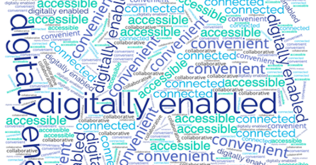
Thought Leaders: Simplicity, Flexibility to Shape the Future of Patient Access
October 23, 2023While the future of patient access is digitally-enabled, when it comes to helping consumers find and schedule care, simp
Read MoreTips to Bring Your IDN’s Digital Experience (Actually) Under One Roof
October 23, 2023The healthcare industry is evolving at an unprecedented rate to keep pace with changing customer needs, government manda
Read More
Digital Self-Service: A Must Have for Consumers
October 23, 2023Online scheduling and access to digital self-service continue to be top priorities for consumers. In fact, 40% of consu
Read More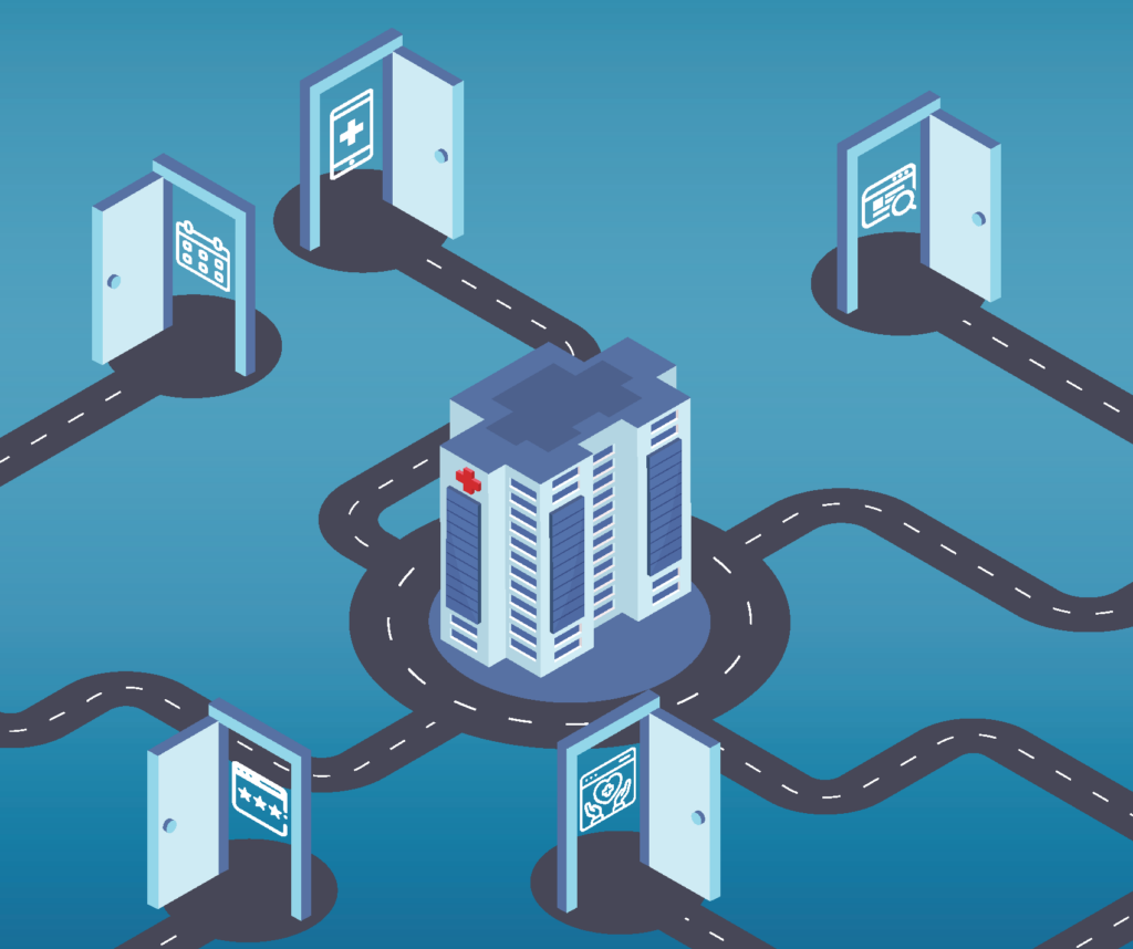
3 Top Strategies for Opening All the Digital Doors for Healthcare Consumers
October 23, 2023The “digital front door” has been a critical element of patient access strategies across healthcare organizations fo
Read More
Demonstrating the Value of Patient Access in Challenging Times
October 23, 2023It’s no secret: most healthcare organizations today are facing significant financial challenges—and there isn’t a
Read More
Becker’s Payer Roundtable Recap: Are Payviders Supervillains or Superheroes?
October 23, 2023Of all the terms used at Becker’s Payer Issues Roundtable in early November—including Integrated Delivery Network (I
Read More
Voices from the Frontlines: Key 2022 Consumer and Provider Research Findings
October 23, 2023Keeping a steady pulse on both consumer and provider perspectives is vital to ensuring Kyruus’ solutions meet the need
Read More
Helping Consumers Find a “Provider Like Me” and Why It Matters
October 23, 2023With nearly 60% of consumers using the internet to find a new provider, it’s critical for healthcare organizations
Read More
Three Ways Medical Groups Can Leverage Digital Self-Service to Drive Growth
October 23, 2023That medical groups and health systems share a commitment to delivering convenient, high-quality care in their respectiv
Read More
The Results Are In: Patients Definitely Prefer Digital Self-Service
October 19, 2023Sometimes it’s nice to have things done for you. Maybe someone made you a delicious dinner or fixed a flat tire on you
Read More
Consumer Choice and Expectations: Highlighting the 2023 Care Access Benchmark Report
October 11, 2023These days when consumers are considering their care options, they have more than just a few providers to choose from. T
Read More
New Research Reveals the Top 3 Things Members Want from Their Health Plans
October 10, 2023Beginning in July 2023, Wakefield Research surveyed 1,000 individuals across the country on behalf of Kyruus to gain an
Read More
Don’t Snooze on the Benefits of Digital Health for Your Sleep Medicine Practice
October 4, 2023Getting enough sleep might seem like a luxury, but doing so is important for your overall health. Not only has insuffici
Read More
Don’t Snooze on the Benefits of Digital Health for Your Sleep Medicine Practice
October 4, 2023Getting enough sleep might seem like a luxury, but doing so is important for your overall health.
Read More
Does Your Pain Medicine Practice Know the Value of Digital Health?
September 27, 2023If you’re human, physical pain is part of your life, at least from time to time. For more than 50 million adults in th
Read More
How to Apply Digital Health to Make Behavioral Health Care More Accessible for Your Patients
September 20, 2023It has been a little more than four months since the United States government announced that the COVID-19 Public Health
Read More
Digital Health: Added Convenience for Urgent Care Centers
September 13, 2023You’re at your son’s Friday night football game when he collides with a player from the other team. He’s not serio
Read More
How Digital Health Tools Help FQHCs Increase Access to Care
September 6, 2023Approximately 60 million United States residents live in rural areas. That’s 15% of the country’s total population.�
Read More
Digital Self-Service Tools for Orthopedic Practices: 3 Tips for Expanding Convenient Access to Care
August 30, 2023EmergeOrtho is North Carolina’s largest physician-owned orthopedic practice with a team of nearly 270 highly-trained o
Read More
Online Scheduling: It’s Not Just for Doctor’s Appointments Anymore
July 26, 2023There are more than 1,077,000 professionally-active doctors providing care across the United States. Of those, a little
Read More
A Study in Success: How collaboration leads to significant impact for one plan partner
July 20, 2023HealthSparq and a health plan client recently spoke with Health Plan Alliance (HPA) members about breaking down access b
Read More
3 Key Considerations for a Successful Provider Data Management Strategy
July 13, 2023We recently had the privilege of hosting Amber Welch, VP of Digital Marketing, Platforms & Planning from Ochsner He
Read More
The Importance of Meeting Patient Preferences
July 12, 2023Not all patients prefer the same type of doctor. Some like a physician who has been in practice for at least a couple of
Read More
The Cost of Delayed Care — and How Digital Health Can Help
June 28, 2023After three seemingly unending years, the COVID-19 pandemic is officially over — according to the United States govern
Read More
The Importance of Negating Patient No-Shows
June 21, 2023Whether you write everything down in a daily planner or simply keep a mental list, chances are you’re going to forget
Read More
The 3 Most Popular Digital Health Tools for Contactless Care
June 14, 2023Contactless care. It might have sounded futuristic a decade or so ago, but these days, it’s an important component of
Read More
Patient Experience Vs. Patient Satisfaction: What’s the Difference?
June 7, 2023Patient satisfaction. Patient experience. Patient engagement. Patient-centered care. Patient retention. There are so m
Read More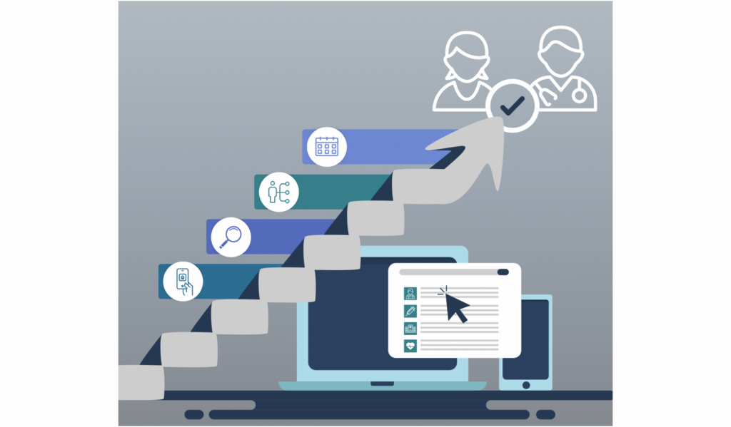
Guide Patients to the Right Care With Your Find Care Experience
May 25, 2023Consumers want convenience, flexibility, and seamless digital access that includes self-service tools to help them confi
Read More
How Much Does a Negative Patient Experience Cost You?
May 24, 2023A patient’s experience encompasses more than just a direct interaction with their doctor. It spans their entire care
Read More
Closing CAHPS Gaps
May 23, 2023Prioritizing provider data accuracy to avoid negative impact In today’s healthcare landscape, patients not only wa
Read More
Utilizing Digital Health to Help Combat the Opioid Epidemic
May 17, 2023One hundred thirty. That’s — on average — how many Americans die every day from an opioid overdose. The federal
Read More
Nurses: Overcoming Obstacles to Provide Quality Patient Care
May 8, 2023Unless you’re a robot, made of Teflon, or somehow immune to injury or illness, chances are you’ve been treated by a
Read More
The 85-million-person Challenge: Medicaid and Your Members
May 8, 2023Getting care is hard enough – connecting members with the right provider shouldn’t be part of the challenge. With ov
Read More
4 Ways to Enhance the Productivity of Your Medical Group’s Front Office
May 3, 2023You go to a new restaurant for dinner. The food is tasty, but the service is horrible. Chances are you’re probably not
Read More
Preparing for the future of Price Transparency: Scaling for member experience
May 2, 2023As the final deadline for the Transparency in Coverage mandate rapidly approaches on 1/1/24, many payers continue to fac
Read More
Digital Health: Promoting a Positive Patient Experience
April 26, 2023It’s been more than 15 years since the Triple Aim was developed by the Institute for Healthcare Improvement (IHI). One
Read More
Improving the Member Experience through Payer-Provider Collaboration: Reflecting on the Becker’s Payer Issues Roundtable
April 20, 2023Dr. Reetika Kumar from Independence Blue Cross (IBX) and Jeff Stuart from CHRISTUS Health sat down with Kyruus’ Presid
Read More
The Advantages of Patient Self-Scheduling
April 19, 2023Convenience. It’s something most Americans expect now, whether having dinner or groceries delivered simply by using a
Read More
Investing in Centralized Provider Data Management to Power Digital Health Initiatives
April 13, 2023As organizations are looking to make strategic technology investments that have significant impact across their organiza
Read More
What is Physician Burnout Costing You?
April 12, 2023If you experience symptoms of a mental health condition, you’re not alone – by any means. More than one in five adul
Read More
5 Ways to Improve Patient Collections
April 5, 2023New isn’t always better. Some products made these days with more advanced technology might seem to be improved but lac
Read More
Healthcare Consumerism in 2023
March 15, 2023When’s the last time you went shopping at the local mall or waited in line to purchase concert tickets? If you’re
Read More
The Primary Care Physician Shortage by State
March 8, 2023The United States Census estimates that the number of Americans over age 65 will grow by almost 10 percent by the year 2
Read More
From contract to partnership: executive perspectives on payer-provider collaboration
March 7, 2023At HLTH22 last fall, the CEO of Blue Shield of California, Paul Markovich, shared his thoughts on partnerships between p
Read More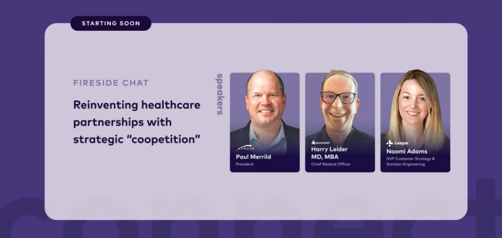
Fill in the Gaps: Partnering Strategies in Healthcare
March 1, 2023At the recent League Connect conference, Paul Merrild, president of Kyruus and HealthSparq, and Harry Leider, chief mark
Read More
6 Ways Your Practice Can Increase Patient Satisfaction
March 1, 2023The customer is always right. This phrase, which is regularly bandied about, allegedly originated from Swiss hotelier C�
Read More
Physician Depression: Rates and Resources
February 22, 2023It’s been nearly 50 years since psychologist Herbert Freudenberger, who often volunteered at a free clinic in New York
Read More
Putting Patient Feedback to Work for Your Practice
February 16, 2023There’s always room for improvement. You’ve undoubtedly heard that phrase multiple times. No one knows for sure who
Read More
4 Ways to Increase Your Patients’ Utilization of Digital Health Tools
February 8, 2023Sporting goods stores and online businesses are full of home exercise products touting unparalleled health benefits. Tre
Read More
How Burnout Is Affecting Allied Healthcare Professionals — and What Can Be Done About It
February 1, 2023Since the start of the COVID-19 pandemic, a plethora of clinicians have reported symptoms of exhaustion, depression, sle
Read More
Patients Are Prioritizing Digital Access — What Should Health Plans Know to Keep Them Engaged
January 25, 2023People have continued to evolve as they search for and select care—adopting sophisticated shopping behaviors similar t
Read More
“It’s Not About a Killer App”: CIO Perspectives on Digital Transformation
January 23, 2023Guest contributor Kate Gamble, Managing Editor & Director of Social Media at healthsystemCIO, summarizes key findi
Read More
20 Tips for Healthcare Providers to Keep Their Mobile Devices Secure
January 18, 2023The average adult in the United States spends 3 hours and 43 minutes on their mobile devices. That tallies up to 50 days
Read More
Helping Consumers Find a “Provider Like Me” and Why It Matters
January 17, 2023Selecting a provider is a personal and nuanced decision for consumers—one that launches a journey of discovery that ty
Read More
New Research: Health Plan Execs Talk Transparency
January 12, 2023For most people, January means a new health plan benefit year. But, this year is different. Now all health plan members
Read More
Three Global Health Issues to Watch in 2023
January 11, 2023If you’ve ever had the chance to travel overseas, you’ve undoubtedly experienced cultures and traditions that differ
Read More
The Biggest Barriers to Accessing Healthcare — and 10 Things You Can Do to Address Them
January 4, 2023Unless you live in the south or work remotely from a tropical island, the weather right now is probably very cold. Some
Read More
Reducing Call Center Volume: Tips and Strategies to Maximize Online Self-service Provider Directories
December 19, 2022For most health plans, the number one reason members call into the call center is related to finding a provider – and
Read More
The Top Three Challenges of Technology in Healthcare
December 14, 2022Wireless headphones, robot vacuums and e-readers are three of the most-requested gifts this Christmas. Unlike a few deca
Read More
How Does Cost Affect Access to Care for Your Patients?
December 7, 2022There was a time when you had to use a paper map to plan your road trip. No simply plugging in your destination and gett
Read More
The 5 Biggest Rural Healthcare Challenges in the U.S.
November 30, 2022What do Telluride, Colorado, Sedona, Arizona and Kennebunkport, Maine all have in common? They’ve all been included in
Read More
The Valuable Impact of a Patient and Family Advisory Council
November 22, 2022What is a Patient and Family Advisory Council (PFAC) and why would you have one as part of a healthcare software company
Read More
Becker’s Payer Roundtable Recap: Are Payviders Supervillains or Superheroes?
November 17, 2022Of all the terms used at last week’s Becker’s Payer Issues Roundtable – including Integrated Delivery Network (IDN
Read More
How Consumers Prefer to Find, Select and Access Healthcare
November 16, 2022Facebook, YouTube and Amazon might be the most-searched terms online, but it didn’t start out that way. Actually, the
Read More
Building a Provider Search Experience Members Can Trust
November 15, 2022It may sound like a no-brainer, but conflicting information about healthcare providers across platforms (think health pl
Read More
8 Reasons Healthcare Providers Should Prioritize Patient Self-Service
November 9, 2022Pumping your own gas might seem like a regular occurrence, but that wasn’t always the case. Before Colorado convenienc
Read More
Healthcare Costs Remain A Major Concern For Health Plan Members
November 9, 2022As 2022 rapidly draws to a close, fresh consumer insights shed light on how consumers are feeling about healthcare costs
Read More
5 Myths About Older Adults and Technology We Should All Stop Believing
November 2, 2022Most of us as children want to grow up quickly. We envision being an adult and enjoying all the benefits that go with it
Read More
Are You Ready To Market Price Transparency?
November 2, 2022Product, data, and engineering teams at health plans have been hard at work building solutions to meet the January 1, 20
Read More
How to Improve the Customer Experience in Healthcare
October 26, 2022We’re all customers. Whether you’ve purchased a new car, paid someone to install a pool in your yard — maybe a lar
Read More
How to Build The Provider Directory Tool That Keeps Members Coming Back
October 25, 2022As one of the most utilized resources on a health insurer’s website, a provider directory should have rich data an
Read More
Five Ways to Tackle Lengthy Patient Wait Times
October 19, 2022Waiting. It evokes various types of feelings, from hope all the way to uncertainty. Biding time for a scheduled vacation
Read More
Patient-Centered Care: Why is it Important?
October 13, 2022Patient engagement. Patient satisfaction. Patient intake. Patient flow. Patient volume. Patent access. What’s at the
Read More
What Is Health Literacy and Why Is It So Important?
October 13, 2022Healthcare providers are facing new challenges balancing quality of care and optimal use of dwindling resources. The cos
Read More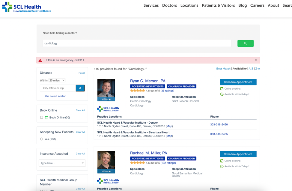
Legacy SCL Health (Now Intermountain Healthcare) Reimagines Digital Patient Access
October 12, 2022As expectations for digital self-service continue to grow, healthcare organizations should regularly assess their digita
Read More
Looking to What’s Next in CX for Health Plans: Highlights from #AHIPDigital
October 7, 2022We recently attended the annual AHIP Consumer Experience and Digital Health Forum in Nashville. At this year’s event,
Read More
10 Recommendations for Helping Patients With Low Health Literacy
October 5, 2022The road to becoming a physician is paved with years of education and training — not to mention a lack of sleep and a
Read More
How Much Does Healthcare Really Cost?
September 28, 2022When people make purchases, one of the first questions is “how much?” And when it comes to big purchases, like a car
Read MoreWhy Interoperability Should Be a Priority for Your Medical Group
September 28, 2022If you’ve ever heard the Johnny Cash song “One Piece at a Time,” you know it’s about two assembly line coworkers
Read More10 Expert Tips: How to Become an Effective Healthcare Leader
September 21, 2022In a 60 Minutes interview with host Mike Wallace nearly 50 years ago, former president Ronald Reagan expressed his thoug
Read More
What to Watch Out For with Using MRFs for Self-Service Tool Compliance
September 8, 2022Last month was a major milestone for the healthcare industry. From 2019 when the federal Transparency in Coverage (TiC)
Read More
Guide and engage members with price transparency
September 1, 2022Many health plan teams have spent the last year heads down, working diligently to meet Transparency in Coverage mandates
Read More
10 Advantages to Using Digital Patient Check-In Platforms
August 31, 2022Paper is suitable for a lot of things. It’s used for money, greeting cards, media publications and more. It’s so pop
Read More
How Digital Patient Intake, Registration Boost Patient Experience
August 23, 2022It’s easy for a patient to become overwhelmed visiting the clinic or hospital. Even the patient intake process is rife
Read More
It’s All About Me: Providers Say Digital Profiles Are Their Chance to Shine
August 9, 2022Online profiles are digital calling cards that must be accurate, comprehensive, and present across channels, according t
Read More
5 Apps Your Healthcare Practice Needs Now
August 3, 2022There are more than 350,000 healthcare apps available, from those used to help patients track their calorie intake to
Read More
Building Providers’ Digital Presence: Here, There, and Everywhere
July 27, 2022Nearly 80% of providers say a high-quality digital presence on their healthcare organization’s find-a-provider website
Read More
Three KPIs That Help Providers Measure Their Progress in Value-Based Care
July 27, 2022Getting value out of a purchase or investment can certainly be satisfying, especially at a time in the United States w
Read More
Realize Big Savings By Incentivizing Consumer Behaviors
July 25, 2022Healthcare is expensive and costs continue to rise. According to the Centers of Medicare & Medicaid Services (CMS),
Read More
Getting Started with Online Scheduling: 5 Key Steps for a Successful Launch
March 2, 2023Today’s consumer is accustomed to doing everything online—and its no shock that this preference carries over int
Read More
Shore Physicians Group: Achieving a Mission to Keep Patients Well-Connected
January 25, 2023When Shore Physicians Group was founded in southern New Jersey a little more than ten years ago, only about half of all
Read More
Insights from Banner Health: How to Transform Your Digital Front Door
July 28, 2020There is little doubt that the COVID-19 pandemic has profoundly reshaped the delivery of care in the United States. We h
Read More
Rewarding Healthcare Choices: Matt’s Story
January 28, 2019It’s always such a nice surprise when we hear directly from people who are benefitting from our solutions. Just recent
Read MoreGet in touch
Learn more about how Kyruus Health
can transform your appproach to connecting
people to the right care.